

One dataset produces two very different burn rates
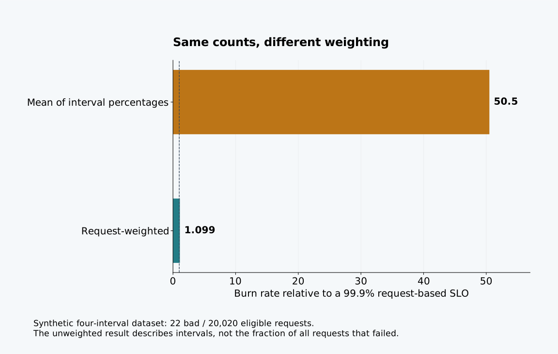
Twenty-two bad requests out of 20,020 eligible requests produce an error rate of about 0.10989%. Against an assigned 99.9% request-based service level objective, that is a burn rate of about 1.099. Average the four interval percentages in the same dataset instead, and the apparent burn rate becomes 50.5.
Both calculations use the same events. The difference is their weighting. One gives every eligible request equal weight; the other gives a quiet interval the same weight as a busy interval. For a request-based objective, the first calculation matches the stated denominator.
These figures come from an original synthetic dataset with four equal five-minute intervals. They are calculated examples, not observations from a production system. Download the request counts, calculation script and complete results to inspect the arithmetic.
Define the eligible request first
For this example, each eligible request has one good or bad outcome. The request-based error ratio is total bad requests divided by total eligible requests over the selected window. Burn rate divides that ratio by the allowed bad fraction. A 99.9% objective allows a fraction of 0.001, so an error ratio of 0.001 corresponds to burn rate 1.
Google SRE's alerting chapter develops burn-rate alerting from good and bad event ratios and discusses the effect of low traffic. The formula is useful only when the numerator and denominator describe the same population and time window. Summing unrelated request counters cannot repair a poorly defined service level indicator.
Decide whether retries count as separate eligible requests or belong to a user-operation measure. Define how timeouts, rejected requests and canceled operations are classified. A successful health endpoint should not silently dilute failures of the customer workflow the objective promises to represent.
For a latency objective, a bad event might be an eligible request exceeding the stated duration rather than an HTTP error. The same arithmetic can apply, but the event classification changes. Keep the threshold and eligibility definition beside the ratio so someone reading a chart can tell what a failure means.
Inspect the four intervals
Two busy intervals each contain 10,000 eligible requests and ten bad outcomes. Two quiet intervals each contain ten eligible requests and one bad outcome. The busy intervals each have a 0.1% error rate; the quiet intervals each have a 10% error rate.
| Interval | Eligible requests | Bad requests | Error rate |
|---|---|---|---|
| I1, five minutes | 10,000 | 10 | 0.1% |
| I2, five minutes | 10,000 | 10 | 0.1% |
| I3, five minutes | 10 | 1 | 10% |
| I4, five minutes | 10 | 1 | 10% |
| Combined, twenty minutes | 20,020 | 22 | About 0.10989% |
The arithmetic mean of the four percentages is 5.05%. It answers a legitimate but different question: what is the average interval error percentage when all four intervals have equal weight? It does not describe the fraction of all requests that failed.
An equivalent way to recover the request ratio is to weight each interval's percentage by its eligible-request count. Keeping the original counts is simpler to inspect and avoids unnecessary rounding before aggregation. The script uses exact fractions internally, then converts results for display.
Equal interval lengths do not make their request populations equal. Nor does selecting a larger dashboard window automatically select the correct aggregation. Inspect whether the query divides aggregated counts or averages already-computed percentages.
Vary traffic without changing the interval percentages
The sensitivity dataset changes each busy interval to 1,000, 10,000 or 100,000 requests while preserving its 0.1% error rate. Both quiet intervals remain ten requests with one error. The unweighted average burn rate stays at 50.5 in every case.
The request-weighted burn rate changes from about 1.980 to 1.099 to 1.010. The quiet errors account for a progressively smaller share of all eligible requests. Nothing about their individual outcomes improves; only their weight in the aggregate changes.
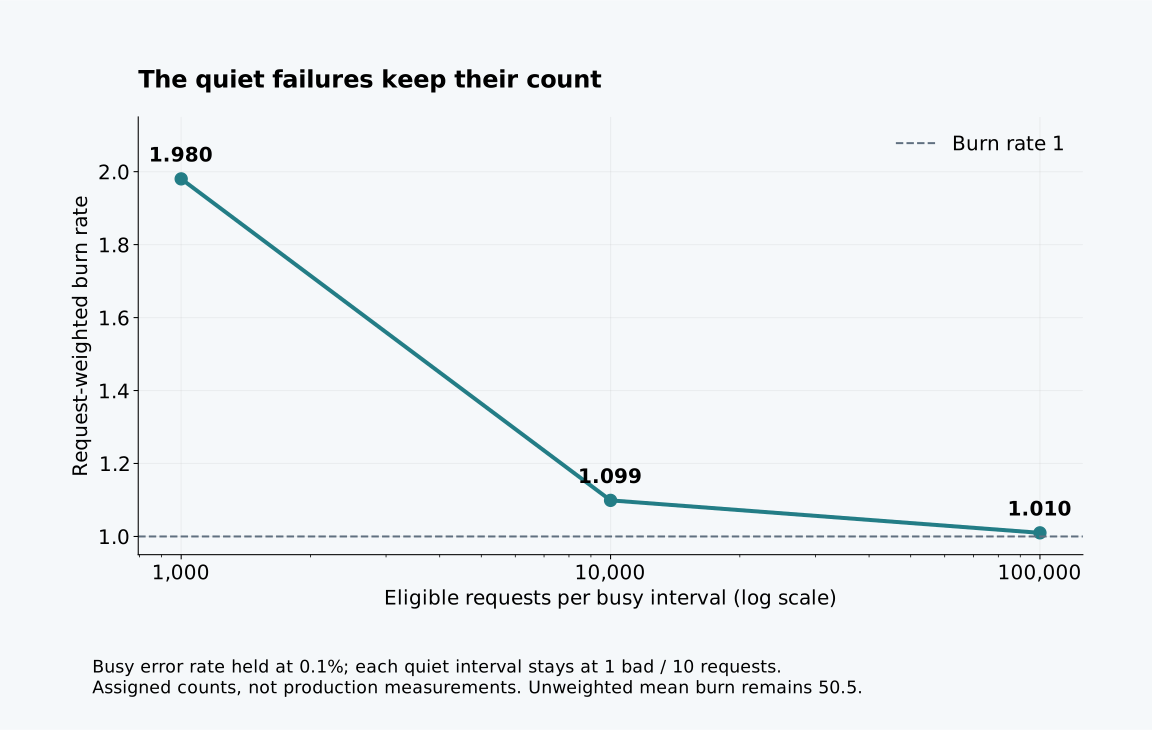
This is a sensitivity calculation, not a simulation of how traffic responds to failures. All counts are assigned and every interval's error rate is held fixed by construction. A real outage can change traffic through abandonment, retries or rejected admission. Those mechanisms would require a different dataset and a clear decision about which attempts enter the objective.
A quiet customer still matters
The aggregate can be calculated correctly and still hide a customer who cannot complete an important task. In this example, the two quiet intervals contain genuine modeled failures. Request weighting prevents them from being overrepresented in the global request ratio; it does not make the customer impact irrelevant.
Separate the service-wide indicator from a customer or workflow diagnostic when that distinction changes the response. A low-volume critical operation may need a different alert or an explicit support signal. State the population of each indicator so the smaller diagnostic is not accidentally added to the global denominator twice. Before adding a customer label to a metric, count the series it can create; the cardinality model compares aggregate signals with detailed diagnostics.
Do not fabricate a healthy ratio when a window has zero eligible requests. The fixture returns an undefined value for zero divided by zero. Absence of requests might be normal inactivity, lost instrumentation or a failure before requests reach the measured boundary. A separate traffic-presence check can distinguish those possibilities when the workflow requires one.
Synthetic probes can add evidence about reachability, but they measure their own operation. Mixing them into customer counts changes the metric. The canary release article applies a related discipline to release cohorts: define the population before interpreting a percentage.
Use the ratio without inventing a forecast
A burn rate of 1.099 over this twenty-minute fixture is not a measurement of the monthly budget remaining. It is the observed-window error ratio normalized to the assigned allowed fraction. To discuss remaining budget, account for the objective's actual reporting period and the events already included in it.
Datadog's burn-rate explanation also distinguishes the normalized rate from its operational interpretation under changing request volume. An estimate of time to exhaustion requires assumptions about future traffic and error behavior. A dashboard should not present that conditional estimate as a deadline known from the current ratio alone.
Before adopting an alert, verify its numerator and denominator on a small exported window, including a quiet interval. Recalculate the result from raw counts and inspect missing-data behavior. Threshold and look-back-window selection comes after that check. If the exported example cannot reproduce the dashboard value, resolve the aggregation difference before tuning the alert.
Sources
Documentation checked .